
Reimagining situational awareness for senior-level decision-makers
01 Overview
During the Winter of 2022, I had the privilege of working as a UX/UI designer, Art director in the SCADpro team that collaborated with Deloitte’s Government & Public Services (GPS), was prompted to reimagine and redesign situational awareness.
The goal was to develop design artifacts that demonstrates how to apply data to drive decision-making through the implementation of human-centered design, aimed at senior-level decision-maker clients.
The scenario we focused on was both timely and critical – monitoring and decision-making in the context of the COVID-19 pandemic, the endless stream of data and decisions provided a rich and realistic context in which to work.
Duration
10 weeks
The Team
Deloitte GPS Engineering Team
Team of 11 students, including:
UX/UI designers
Graphic designers
Motion media designers
XR designers
Sound designer
My role
UX/UI Designer, Art Director
Tools Used
Figma
Keynote
Adobe Suite
Miro
02 The challenge
Understanding Situational Awareness
Before delving into the project, it's important to understand the key concept at its core: situational awareness. Essentially, it's about having a clear understanding of what is happening around you and being able to predict how it will change in the near future. This understanding is crucial for making timely and effective decisions.
In the context of our project, situational awareness is particularly vital for senior decision-makers who frequently face complex scenarios with a plethora of information. The challenge lies in not just accessing data, but in efficiently organizing, prioritizing, and interpreting it to make informed decisions during urgent crises.
Profusion of data available to decision makers now swamps rather than aids decision making.
The problem was first raised by our clients during our kickoff meeting. To better understand the issue, we conducted research including site visits, and uncovered several critical design challenges in existing situational awareness systems. These issues included:

Data Overload on Screen
The presence of excessive datasets on a single screen led to overwhelming information clutter. This data congestion impeded users' ability to quickly comprehend and interpret critical information.
Color Overload in Visualizations
Overuse of varied colors in data visualizations resulted in visual chaos. This not only strained the users' eyes but also muddled their ability to analyze data effectively.


Absence of Visual Hierarchy
The lack of a well-defined visual hierarchy forced users to spend excessive time searching and organizing information on the screen. This inefficient layout obstructed swift and accurate decision-making.
Cumulative Effect of Design Flaws
In scenarios where these issues converged, the user experience deteriorated significantly. Users faced discomfort and confusion, severely impacting their ability to make informed decisions in time-sensitive situations.

so…
How might we reimagine situational awareness to empower senior decision-makers to better recognize, respond to, and resolve urgent crises?
03 The process
Generative Research
To gain a deeper understanding of the issues at hand, we embarked on an immersive research phase. Our research included site visits to the Chatham County Emergency Management Agency (CEMA) and SCAD Security.
SCAD Security Visit
On a trip to SCAD Security, our team was able to take a look through how the school handles safety and security, looking at cameras and data monitoring for any suspicious data. We took a tour of the facility, which helped us understand a different scope of looking at a university and understanding what data is most important. This visit helped our team frame the system so that it could not only be applied to the COVID-19 case study but any type of situation.
CEMA Visit
Our team met with Aaron Thompson from Chatham County Emergency Management Agency, who gave a better understanding of their two locations down in Savannah, Georgia. We learned about Emergency Operation Centers — how these many different people come together in such a small, crowded space to look at data and be able to communicate with one another. We also looked at the request system they use for responding to emergencies, which helped inspire the need to emphasize the specific need for requests within the system.
Ideation & Design
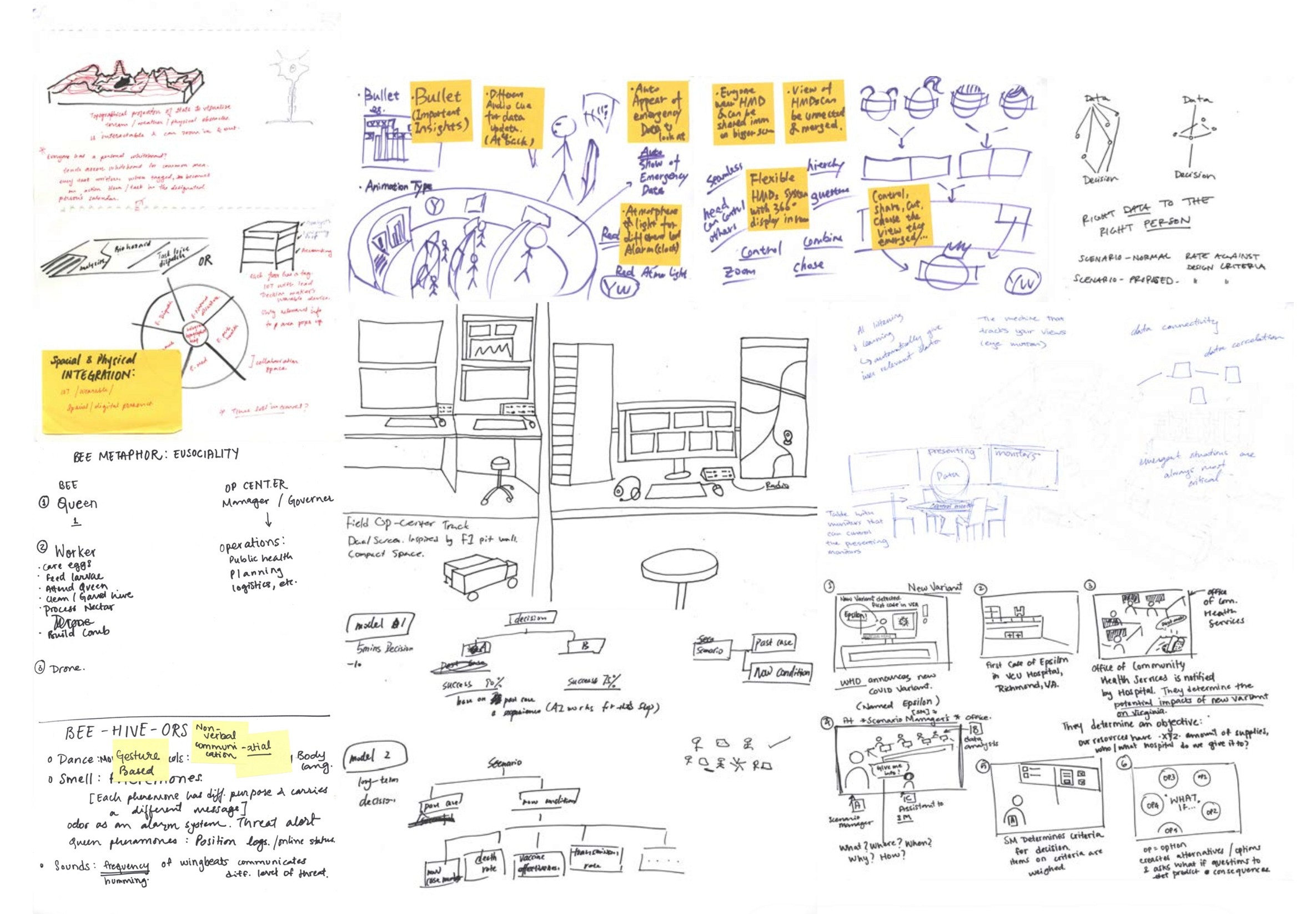
Sketches
Evaluative Research
Eye-tracking
User tests were conducted with 5 participants without previous knowledge of situational awareness design. The tests tracked the participants’ eyes to where they looked and what order they were looking during the test. These images summarizes the user’s eye movement, showing the most common paths they took.
This test verified that our designs followed the research for best practices for visual layout. We found that we were successful in our use of visual guidance, while not as successful in the case of the data retrieval page.
04 The solution
Through principles of visual perception, finely tuned spatialized audio, and explorations of immersive technology, Mobius enables faster, more accurate decision-making within high-stress, time-pressed, crisis situations.
The system utilizes three main areas to deliver a situational system built off of core design elements. My primary responsibility was the visual design aspect of the system.

Visual Design
to optimize visuals for quicker decision-making

Audio Design
to incorporate sounds to aid data comprehension and communication

Tech Interventions
to enhance visualization and user experience through immersive technology
In the development of the design artifacts, my primary focus was on establishing a clear visual hierarchy. This was crucial in enabling decision-makers to effortlessly navigate through the interface, regardless of the device used, and quickly access the most relevant data in time-sensitive situations. To reimagine data prioritization, I employed a series of design elements and principles,
Color: Utilized to differentiate data sets and highlight critical information.
Contrast: Employed to draw attention to key areas and improve readability.
Space: Carefully managed to avoid clutter and emphasize important data points.
Size: Adjusted to signify the importance of various data elements and guide the user's eye.

Alert Notification
appears on the main screen of Mobius as an alert pops up when an alert is triggered. De-emphasizes the other parts of the screen, focusing on the issue at hand and how action needs to be taken.
Situational Awareness Dashboard
shows the requests and alerts at hand, displaying them both in a map format and within numbers themselves for the number of nurse requests by county.
Consequence Analysis
allows the user to use the current data to generate consequence analysis of predicted outcomes through user input of potential data requests being fulfilled.


